MPage Table Component
The MPage table component offers a simple one line option for transforming your Angular data objects into fully interactive tables. The table offers many advanced features which are all controlled through various settings you assign in your MPage code. The table control is compatible with both Microsoft Edge and Internet Explorer, however pagination is defaulted on Internet Explorer and column freezing is only available in Edge.
The video below demonstrates the table component in action.
Implementation
The MPage table component is added with the <mpage-table></mpage-table> element in your HTML portion of your Angular component. The table below identifies all the options available.
Options Grid
| Item | Binding | Data Type | Description |
|---|---|---|---|
| class | Input | string |
Allows you the ability to pass your own CSS configuration for some table display options. For example, passing a value of "my-table-settings" will replace the "default-table-settings" shown below. Please ensure you have defined your custom table settings in your styles.scss file and feel free to experiment with colors and sizes. .default-table-settings {
.mat-row {
height: auto;
}
.mat-header-row {
height: 2rem;
}
.mat-header-cell {
padding: 3px 8px;
}
.mat-cell {
padding: 3px 8px 3px 8px;
}
.mat-row:hover {
background-color: rgb(236, 236, 236);
}
}
|
| clickColumn | Output | EventEmitter<any> |
Ths clickColumn emitter allows you the ability to associate an Angular method to the action of a user clicking on a single column on the table.
<mpage-table ...... (clickColumn)="tableCellClick($event)" ....> The $event variable passed to your custom method will be of an "any" type and will contain the following content.
column: "string containing the name of the column clicked.",
columnData: 'string containing the value displayed in the clicked column.",
row: {data object representing the row that was clicked.}
|
| clickRow | Output | EventEmitter<any> |
Ths clickRow emitter allows you the ability to associate an Angular method to the action of a user clicking on a single row on the table. <mpage-table ...... (clickRow)="tableRowClick($event)" ....> The $event variable passed to your custom method will be of an "any" type and will contain the entire row being clicked. If your table is using the contextMenu option and a user performs a right-click context menu action, a property called 'contextMenuAction' will be added to the $event variable containing the label of the context menu option chosen. |
| columnConfig | Input/Output | IColumnConfig |
The columnConfig object contains values for custom column configuration, sorting and how many columns should be frozen on the left. While you could write code to build out a custom columnConfig object to control which fields are displayed and which order, the intention is to provide you with an object that you can use to save end user preferences for retrieval later. If you wish to learn more on the IColumnConfig interface documentation is provided below. |
| contextMenu | Input | IContextMenu[] |
You can introduce a 'right-click' context menu into your table by passing an array of IContextMenu values into your table control. Your IContextMenu values require a label value and can optionally include an icon property representing the name of an Angular Material Icon. You can determine which context menu was chosen by an end-user by accessing the "contextMenuAction" property passed to the (clickRow) method of the MPage table. The value for "contextMenuAction" will contain the label value associated to your IContextMenu array. <mpage-table ...
[contextMenu]="[{icon: 'content_cut', label: 'Cut'},{icon: 'content_copy', label: 'Copy'}, {label: 'Paste']" ...
(clickRow)="tableRowClick($event)" .. >
|
| params | Input | ITableParams | The params options offers a number of fine-tuning configuration options for your table such as setting performance thresholds, hiding/revealing columns, date formats, pagination and scrolling. Please see the full list of options below in the Params Grid documentation. |
| tableData | Input | any[] |
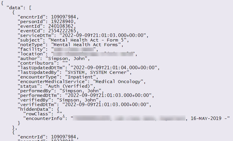
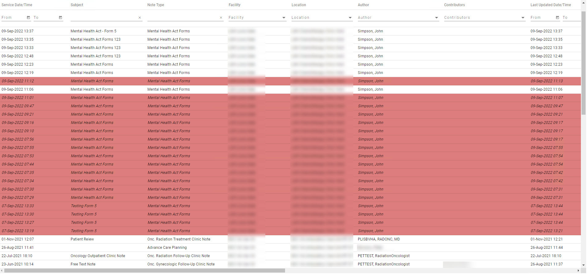
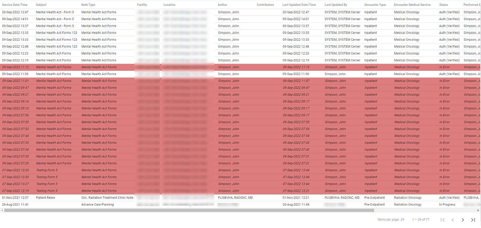
The tableData input represents the data you wish to pass to the table. Any flat tabular data object will work including data retrieved from sources other than CCL. Each item in your data source must be of a value type that can be read by the table control such as a string, number or date value. The only exception to this rule is an optional data object called hiddenData which you can pass on additional information not shown on the table for other uses. Field names are automatically converted from camelCase to proper case for presentation in your table. For example, "lastUpdatedBy" becomes "Last Updated By" in the heading of your table. Fields ending with the words DtTm (e.g. "serviceDtTm") indicate that the field should be displayed as a Date/Time field and the title is appropriately presented. Fields ending with the word Date will be displayed on the table as a date value without the time. Cerner fields ending with "Id" or "Cd" are not displayed on the table unless specified in the options settings described later on this page. |
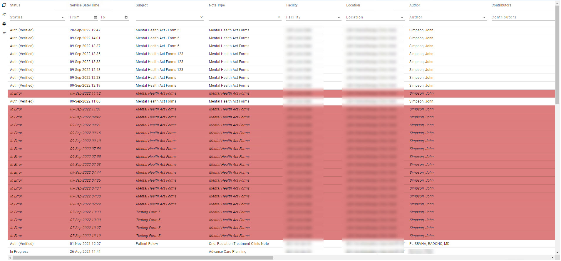
| toolbar | Input | boolean | If set to true, the toolbar option enables a toolbar on the left side of the table for the purpose of clearing all filters, setting multiple column sorting, end user column re-arrangement and the clearing of said sorting and column configuration. The default value is set to false. |
Hidden Data
Earlier we mentioned that each row of data in your data object provided to the table can have a "hiddenData" element containing other items. The hiddenData object is excluded from view in your table however the data is completely accessible in your code. A common use for the hidden data may be information you wish to use after the user has clicked a row or column on the table.
The hidden data object also offers an optional item called "rowClass" which lets you pass a CSS class name for the row. This may be useful if you wish to highlight a row based on the content of that row (e.g. A InError document).

Angular Material Icons
Adding an icon as column content is done entirely through your CCL code by creating a column in your rCustom record structure with the identifier "_icon" at the end of the field name and assigning a partial JSON string to your field value.
Any record structure fields marked with the name "_icon" (e.g. ok_icon, default_icon, at_risk_icon, etc.) will be interpreted as an icon field by the MPage table component.
The partial JSON string must start with the value '{"icon":' and cannot have any spaces in this portion of the string. Valid properties in the JSON string include icon, color and class. A value for icon is required where color and class are optional. Providing a value for icon only will use the default text color of the table.
- icon - Textual name of an Angular Material icon.
- color - Angular Material color name ('accent', 'primary', 'warn').
- class - Name of any valid CSS class in your project
The example below defines an icon called default_icon which will display a check mark icon. The MPage table component converts the name default_icon to a title of "Default" on the MPage.
record rCustom (
    1 data[*]
        2 cust_id                       = f8
        2 default_icon                  = vc
        2 ...your code...
)


.. your code ...
rCustom->data[nCount].default_icon = ^{"icon":"done_outline","color":"accent"}^
.. your code ...
Params Grid
The params option described above has a number of optional values that can dramatically affect how your table appears and performs.
| Parameter Name | Data Type | Default Value | Description |
|---|---|---|---|
| allowColumnSort | boolean | true | Enables/Disables the ability to click column headers for sorting. Does not affect toolbar menu sorting. |
| columnFilter | boolean | true | Determines if filters are visible at the top of the table allowing users the ability to refine the content being displayed. |
| dateFormat | string | 'dd-MMM-yyyy' | Assigns the display format of any date fields shown on the table. |
| dateTimeFormat | string | 'dd-MMM-yyyy HH:mm' | Assigns the display format of any date/time fields shown on the table. |
| dtTmLabel | string | 'Date/Time' | Defines the postfix label assigned to Date/Time columns on your table. For example, if 'birthDtTm' exists as a field on your table it would have 'Birth Date/Time" displayed as a label. |
| emptyDateLabel | string | '' | Determines the content to be displayed in your table if a date field is blank or set to '0000-00-00T00:00:00.000+00:00'. By default a blank space will be shown however you can change it to any text you desire. |
| filterThreshold | number | 2000 | Live filtering of large tables can slow the performance of your MPage down considerably. The filterThreshold parameter lets you assign when live filtering is disabled forcing users to press the enter key between filter searches. If the number of items in your table is less than the threshold, users will see filtering take place as they type. If the threshold has been met, a message is displayed under the field indicating that the enter key must be pressed to perform the filter. |
| hideCdValues | boolean | true | Determines if fields ending in Cd should be displayed in the table or not. |
| hideIdValues | boolean | true | Determines if fields ending in Id should be displayed in the table or not. |
| horizontalScroll | boolean | true | Determines if columns should be sized to fit the data and present a horizontal scrollbar or if content should be squeezed horizontally to fit on screen. If you are running Internet Explorer or using pagination this setting is forced to true as the paginator cannot handle variable row heights. |
| listFilterSize | number | 15 | Indicates the maximum number of unique values found for a column before the column filter switches from a multiple-value select box to a simple text search. |
| paginator | boolean | false | Indicates if a paginator should be used instead of a scrolling table. The number of items in the paginator is determined by the available container space of the table component. The paginator is also forced if the table is viewed in Internet Explorer. |
| treatAllAsText | boolean | false | Disables detection of date fields and treats all content as text. |
Examples
Simple table using defaults and a data source called myData
<mpage-table [tableData]="myData"></mpage-table>
Table forcing paginator and no filtering
<mpage-table [tableData]="myData" [params]="{paginator: true, columnFilter: false}"></mpage-table>
Table with toolbar enabled, row click method assigned and storage of columnConfig for saving later.
<mpage-table [tableData]="myData" (clickRow)="tableClick($event)" [toolbar]="true" [(columnConfig)]="columnConfig"></mpage-table>
Interfaces
IFilter
interface IFilter {
    type: string;
    column: string;
    values: any[];
    search: any[];
}
IColumn
interface IColumn {
    column: string;
    label: string;
    visible: boolean;
}
IColumnSort
interface IColumnSort {
    column: string;
    sortDirection: string;
}
IColumnConfig
interface IColumnConfig {
    columns: IColumn[];
    columnSort: IColumnSort[];
    freezeLeft: number;
}
IContextMenu
interface IContextMenu {
    icon?: string;
    label: string
}
