MPage Calendar Component
The MPage calendar component lets you display a bindable pop-up calendar field with a single line of code. Based on the Angular Material Calendar control, this data entry field uses the Clinical Office Date Picker Header 2 control to allow you quick and simple access to the calendar control without having to write the standard boilerplate code.
Implementation
Implementation is a simple matter of adding the <mpage-calendar></mpage-calendar> element to your Angular HTML page with a label and bindable variable.
<mpage-calendar label="Birth Date" [(ngModel)]="dateVariable"></mpage-calendar>
The example above produces the following field bound to the variable "dateVariable".

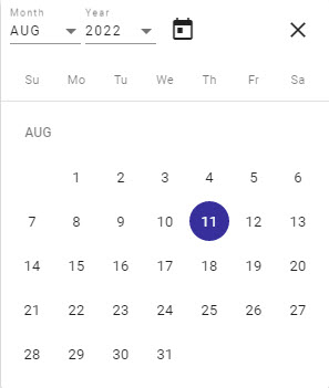
When clicked, the user would see the following drop down calendar.

Other options exist to control styling and date limits. A full list is shown below.
Options Grid
| Item | Binding | Data Type | Description |
|---|---|---|---|
| class | Input | string | CSS class to apply to the field. |
| datePickerHeader | Input | DatepickerHeader Component | V4+ With version 4, the standard Angular Material date picker header is now being used. If you wish to use either of the two custom Clinical Office Datepicker header components or wish to create your own, you can instantiate them as a variable (see the Date Picker Header component documentation) and pass that variable to the calendar control. |
| hintLabel | Input | string | Optional hint label to display below field. |
| includeTime | Input | boolean | V4+ Passing a value of true results in a time field being revealed along with the first date. |
| label | Input | string | Text to display in field to identify it to users |
| max | Input | Date | Maximum date value to allow. Users cannot click a date past the date provided. |
| min | Input | Date | Minimum date value to allow. Users cannot click a date before the date provided. |
| ngModel | Input/Output | Date | < V3 The variable which contains your date value. |
| ngModel | Input/Output | Date | V4+ The variable or array of two dates which contains your date value(s). Passing in two date values will switch the view to a date range allowing the collection of a from and to date. |
Date Formatting
In the examples shown on this screen, the date is formatted as MMM-DD-YYYY. The default setting in your app.module.ts is set to the Cerner standard of DD-MMM-YYYY. If you wish to change this format as we have done in this example, modify the MAT_DATE_FORMATS provider in app.module.ts to match your desired formatting.
  providers: [
    {provide: ErrorHandler, useClass: ErrorHandlerService},
    {provide: DateAdapter, useClass: MomentDateAdapter, deps: [MAT_DATE_LOCALE]},
    {
      provide: MAT_DATE_FORMATS, useValue: {
        parse: {
          dateInput: ['DD-MMM-YYYY'],
        },
        display: {
          dateInput: 'DD-MMM-YYYY',
          monthYearLabel: 'MMM YYYY',
          dateA11yLabel: 'LL',
          monthYearA11yLabel: 'MMMM YYYY',
        }
      }
    }
  ],
